CTA: How Do Calls to Action Fit in your Marketing Strategy (and How to Come Up with an Effective One?)
The CTA – or Call to Action – is much more than a simple, well-placed link designed to attract the attention of a web page’s visitors. Instead, it’s a crucial, conversion rate-boosting lever that every web developer should master. This well-known web marketing term refers to one of the very last stages in the conversion process, where a visitor or a prospect becomes a customer. You need to be intentional when creating a call to action, meaning nothing must be left to chance. The message, wording, colours, as well as where the button is placed within the page… it all matters. Let’s explore what a CTA is, exactly, the role it plays in a marketing strategy, and how to create one that will work as intended.
What Is a Call to Action (CTA)?
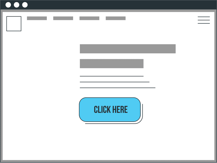
A CTA – or Call to Action – looks something like this:

It’s a clickable element located within a web page’s content, whose aim is to encourage users to perform a specific action that falls under the scope of a marketing strategy. The CTA may be placed on a website’s static page or in a blog article, an email, a banner ad, etc. It could take the form of a button (an inset whose colour contrasts with the background), a link, an image, or even a popup window.
What’s a CTA for?
To encourage the user to interact with a page so they progress down the conversion funnel. That’s the goal of a CTA. Once the user has clicked the link, they are sent to a landing page which explains the CTA’s offer in more detail and gives them the possibility to perform the action – often after filling out a form. This could include…
- Getting in touch with the company
- Downloading content
- Subscribing to a newsletter
- Attending an event
- Adding a product to the basket
- Asking for a quote
- Etc.
Whatever the action, the aim is usually to strengthen the relationship between the user and the company. A typical example is that of a user who clicks on a CTA, lands on a page that contains a form, and provides their details so they can download a document in exchange. In doing so, the user confirms their interest in the company’s products/services. Meanwhile, the company has collected an email address it can use to keep in touch with the visitor, who will be added to the database and considered a prospect.
For that reason, the nature of a Call to Action is to create an incentive, to call the user to perform an action. That’s why CTAs often contain dynamic verbs or wording that highlight something to be gained: “Click here”, “Download our document”, “Register now”, “Call the number”, and even “I’m interested”, “I want the free doc”, “Tell me more”, “Special offer”, “Free trial”, etc.
The Call to Action as a Conversion Lever
Just by looking at the CTAs on a web page, Internet users know exactly how to progress down the conversion funnel. Which makes it the most important element in a landing page or ad. The goal is indeed to establish a connection between the offer and the content to promote conversion.
Without a CTA, it’s difficult – or even impossible – to achieve your objectives on the web. Once read, a blog article with no CTA generates no interaction; landing pages are invisible; forms remain unfilled; baskets stay empty. On the other hand, a well-positioned CTA – at the end of an article that the user read the whole way through for example – which prompts the user to sign up to a newsletter, or access content on a similar topic, is very likely to hit home.
The figures show just how useful a CTA can be for conversion. Thus, an email which contains a single CTA boosts the click-through rate by 371%. Adding a Call-to-Action button to a Facebook page makes it shoot up by 285%. And including CTA buttons within blog article templates tends to increase revenue by 83% in one month (Source).

How to Create a CTA that Converts?
A CTA is a major conversion lever, and crucial to the success of any marketing strategy. Except that, naturally, you can’t just place whatever link on whatever page and hope to see your conversion rate go through the roof. A lot of detail goes into creating an effective Call to Action, meaning that it should be supported by a well-thought-out strategy and follow best practices in terms of optimization.
The CTA as a Marketing Achievement
Since a CTA is meant to promote action, the promise it makes must always be supported by dedicated content, designed to bring true added value for the user. For example, if a Call to Action sends the user to a page where they can register for a webinar, the latter needs to be connected (from a topical perspective) with the message or content that led the visitor to click in the first place.
In essence, much of the conversion work happens ahead of the Call to Action, meaning that the user clicking on it is the result of a marketing process. Creating a CTA involves considering the target itself, how far down the conversion funnel it stands, and the action you want to encourage.
- Understanding your audience is instrumental in generating an attractive, relevant Call to Action that promotes an offer based on actual needs and is aimed at a specific target (in terms of design and wording).
- You should also know how far down the conversion funnel the user who will see your CTA is. A visitor who only just discovered your website should not be offered the same CTA as a lead who has confirmed their interest in your products/services, or a prospect ready to become a client.
- Finally, the action itself depends on your objectives. Are you looking to collect email addresses? To convince Internet users to register for a training course? To sell products? To have as many people as possible see your content?
CTA Optimization Criteria
Once these requirements are taken care of, all you need to do is create (and optimize) your CTA so that it fulfils its task effectively. To this end, there are several criteria to consider.
Design
The shape you give your CTA – and the colours you select – greatly impact its visibility, as well as how it is perceived. Such stimuli can influence the user’s opinion. What matters the most here is to ensure that your CTA stands out against its own environment. Choose attractive colours – that match your visual identity – and make sure they create a contrast with the background for a more visible button. The most common colours for CTAs include orange, blue, red, and green.
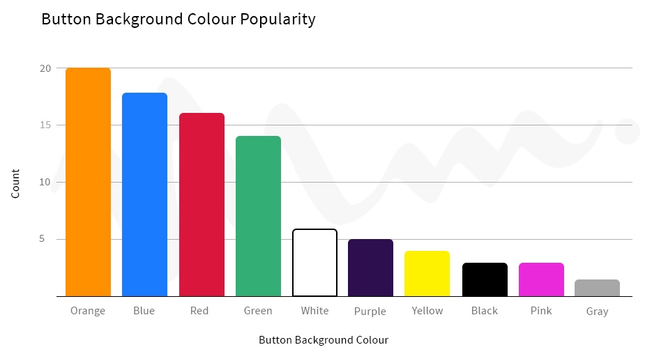
(Source: AdEvolver)
Size
When it comes to CTAs, size matters! Firstly, because it impacts how visible the button is within the page – it must be big enough for users to see it easily, but not so big as to take the attention away from the content. And secondly because it needs to contain a message – though it’s best to keep it as concise as possible, see below. In that regard, the most effective CTAs are often the lighter ones. In the example below, increasing the size of the CTA button has reduced the conversion rate by over 10%!
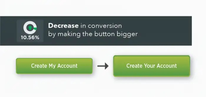
(Source: Unbounce)
Placement
One might believe that the area located just above the fold is the best placement for a CTA. But this doesn’t take into account the fact that clicking a CTA button is supposed to be the result of a thinking process. Before they click, the users first need to understand the added value of the offer they’re looking at. That’s why the best spot hovers between the middle and the bottom of the page – which makes sense if you consider the reasons that encourage a user to click. Still, keep in mind that there is no one-size-fits-all solution.
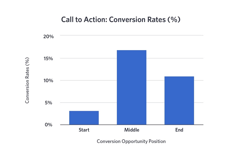
(Source: Wistia)
Message
A CTA is also a value proposition. The message should therefore be clear, concise, and easy to grasp, all while highlighting the concrete benefits of clicking the button. Thus, using a certain type of wording can have a strong influence on the conversion rate, as shown in the chart below.
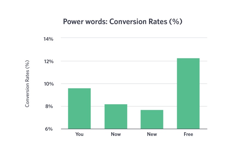
(Source: Wistia)
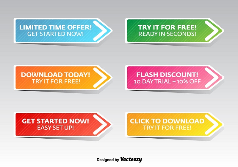
What also works really well is to create a sense of urgency by calling the user’s attention to a limited-time offer, or a deal the applies while stocks last, for example. Using wording that refers to notions of time sensitivity or exclusiveness increases your chances of reaching your goals.
Call to Action
There’s a reason for the name: a CTA is supposed to encourage Internet users to act by addressing them in just the right way. We mentioned the fact that CTAs often involve dynamic verbs. This is true, but you should always choose them well! The graph below shows that the terms “Signup”, “Register”, “Download”, “Click”, and “Try” all generate conversions (the most effective one being “Signup”). Yet, the verb “Buy” clearly underperforms.
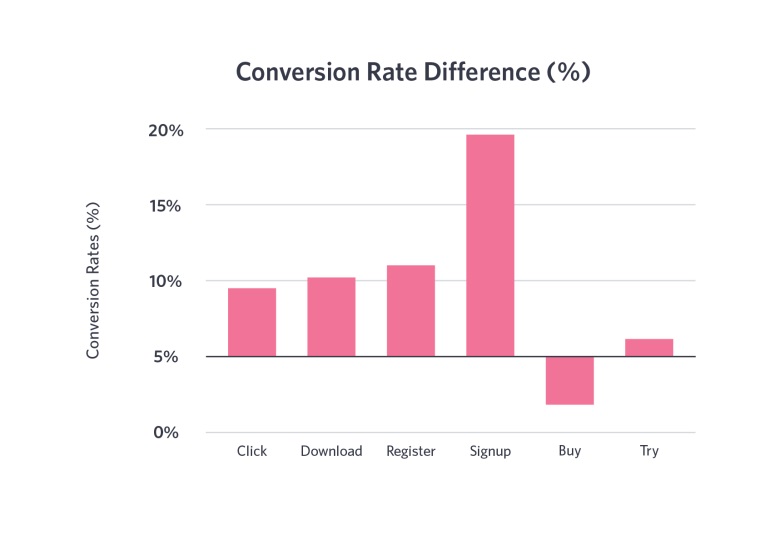
(Source: Wistia)
What may seem like details can drastically alter the efficiency of a CTA. This example shows that changing a single term (“my” instead of “your”) impacts the conversion rate by 25%! Moral of the story: Using the first person in a Call to Action helps catch the users’ attention and results in more clicks.
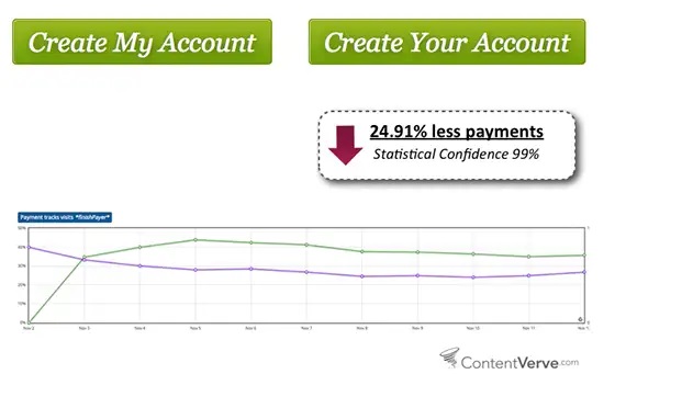
(Source: ContentVerve)
Should your Place One or Several CTAs in a Single Page?
In theory, this isn’t a good idea – if we’re talking about placing several CTAs that refer to different offers within a single page, rather than several CTAs that point to the same content. Unbounce has shown that having multiple clickable links tends to create confusion and that landing pages that focus the visitors’ attention on a single CTA are more effective. The more CTAs are included on a page, the lower the conversion rate tends to be:
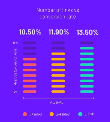
(Source: Unbounce)
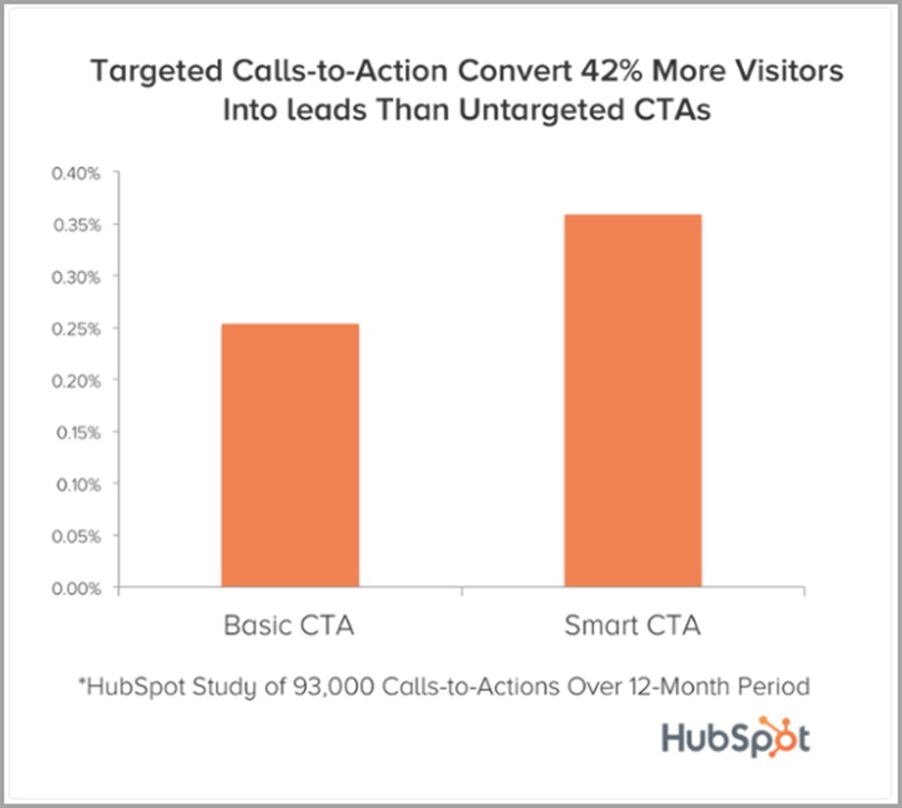
“Smart” CTAs
It is possible to create “smart” CTAs, whose content varies automatically based on the user’s situation (type of device being used, country and language, stage in the conversion funnel…). For example, a visitor who comes back to your website having already downloaded a file called “Document A”, could be prompted to download “Document B”, or a software demo. The same goes for users who followed a CTA for a registration to attend a webinar from their desktop computer. Visiting the same page from their smartphone could result in a different CTA.
According to HubSpot, personalized CTAs perform 202% better, while “smart” CTAs convert 42% more users.
Run Some Tests!
The best way to know whether a CTA is effective is to measure its performance by testing it under real-life conditions – as not all users react in the same manner.
To this end, you could conduct A/B testing, which will reveal how convincing a Call to Action is to your target audiences. This solution allows you to test different variants (in terms of design, fonts, format, placement…) and to analyze the results for every category of prospects. Be sure to change only one element at a time and to set a time limit for your test.
To sum up, the CTA is one of the most prominent elements in any marketing strategy aiming to convert visitors into leads, leads into prospects, and prospects into clients. Yet, its effectiveness depends both on the quality of the offer and on how finely tuned the Call to Action is. It is especially important to play around with several criteria and to keep testing until you find THE ideal formula, one that matches your audience and allows you to fulfil your objectives.

Need to talk with an expert?