It simply has to be one of the most famous logo designs there ever were, since it is seen by billions of users around the world every day. It also belongs to the most famous search engine of all time, Google. Do you know where this logotype comes from? What it means? What makes it so special? And do you want to find out how it has evolved over the years? Let’s embark on an almost 2-decade journey to discover the Google logo’s history!
The characteristics of the Google logo
From 1998 (which is when the search engine was officially launched) right up until today, the Google logo’s history has unfolded, only making it more special over the years.
THE LOGOTYPE’S CHARACTERISTIC FEATURES
Whatever the shape it ends up taking, the Google logo always subscribes to four main principles: simplicity, colours, clearness, conviviality. Any changes that occurred over the course of the Google logo’s history have built on these foundations from the get-go.
FLEXIBILITY
As someone who is quite familiar with Google Search, the logo’s history may have unfolded before your very eyes! For instance, you know that the firm changes its logo design every so often, to celebrate a specific event (national holidays, such as Bastille Day or the 4th of July, the Olympic Games, etc.), or to pay tribute to people and circumstances that have made a mark on History. These are the Google Doodles, and they only stay up for a single day.
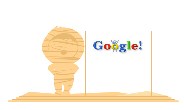
The very first Doodle dates all the way back to 1998. That year, Google’s founders, led by Larry Page and Sergey Brin, went to the Burning Man Festival in the Nevada desert. The event is symbolised by the festive burning of a large, human-shaped figure. An image that Google included in its logo in the form of a silhouette reminiscent of the “burning man”.
The symbolism of the colours of the Google logo
Another interesting aspect of the Google logo’s history resides in its alternating colours, which have always remained the same: blue, red, yellow (which is now slightly orange), and green. These four colours reflect the four tenets of the logo. Each one of these colours has its very own symbolic value:
- Blue (used for the “g”): confidence, strength, trustworthiness
- Red (used for the first “o” and the “e”): emotion, youth, boldness
- Yellow (used for the second “o”): optimism, clarity, warmth
- Green (used for the “l”): serenity, health, growth
Better still, this combined choice of colours also has a meaning of its own. They are all primary colours – colours which, when mixed, create every other existing hue – except for green, which is a secondary colour. This, Google uses to symbolise that the firm will always know how to go beyond its own rules and show a disruptive mindset!
The meaning of Google
So, where does Google’s name come from?
In mathematics, the googol is a very large number, 10100, equivalent to the digit 1 followed by 100 zeroes. It was mentioned for the first time by mathematician Edward Kasner in his book published in 1940, Mathematics and the Imagination.
Larry Page and Sergey Brin themselves told the story of how the term initially appeared. They asked computer science students to come up with names for their company, and one of them put forward the word “googolplex” (an even larger version of the googol). Page and Brin found the idea interesting and opted for the simpler googol, as the perfect symbol of the mission they gave their search engine: to bring order to the immense amount of heterogenous data on the Internet.
As for how “Googol” became “Google”, there are two variants of the story. The first claims that the name change is the result of a typo: someone’s finger slipped on their keyboard, a few letters were swapped around, and there it was, Google! The second, more credible one, suggests that the domain name googol.com was already taken, and that Page and Brin opted for the expression closest to the original term.
Finally, another theory going around is that Google’s name is a tribute to Lego, the famous plastic bricks beloved by children everywhere. And it certainly is tempting to believe it: “Google” is written using the same lettering, the colours are the same as the bricks’… And the symbolism is just as strong: creating a whole world from just a few building blocks!
Evolution of the Google logo since 1998
In closing, let’s look at how the Google logo’s history has progressed since the search engine was launched back in 1998.
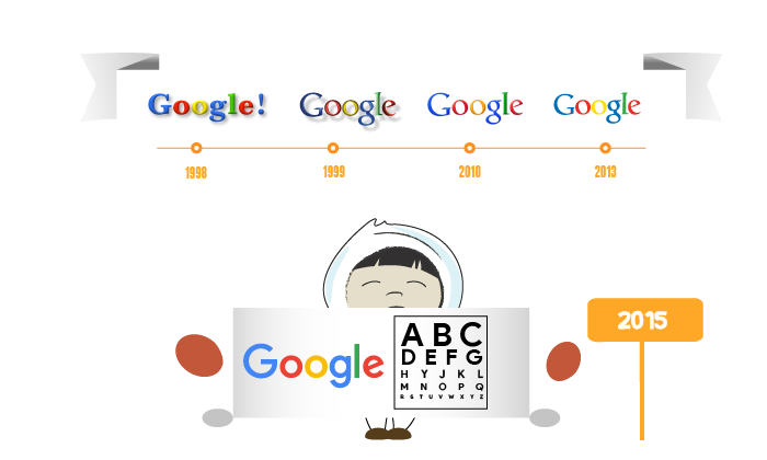
SEPTEMBER 1998
Larry Page and Sergey Brin are both students at Stanford. Together, they create the Google logo as their final year project, with Brin as the designer. The exclamation mark at the end was certainly borrowed from Yahoo!, which is hugely popular at the time.
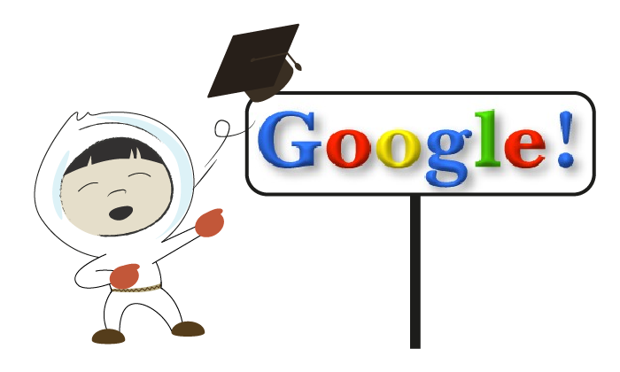
MAY 1999
The new version of the logo is conceived by Ruth Kedar, who is then a design teacher at Stanford University. It has the same playfulness (the fun colour palette) yet aims for more sophistication. It uses the Catull typeface. This version of the Google logo will remain the same for over a decade.
MAY 2010
In 2010, the Google logo becomes brighter, takes on more vibrant colours, and its drop shadow is reduced. This gives it a more tangible and real look than the previous logo.
SEPTEMBER 2013
Thanks to flat design, the logo becomes flat once and for all. Its typography changes a little, and even the colours of Google’s logo get lighter still. The new Google logo appears at the same time as a new interface.
SEPTEMBER 2015
For the first time since 1999, the Catull font is replaced. The Google logo is now made up of a font created specifically for it, Product Sans, now one of the most well-known sans serif typefaces. Unveiled a few weeks after the inauguration of Alphabet, the holding to which Google and its subsidiaries belong, the logo sports a bolder typography, which makes it stand out better on mobiles and other connected devices. It comes with a complete redesign of the “G” favicon (which still has the same four colours).
A visual identity in phase with its time
Google’s latest visual identity reflects how it has evolved over the years. It is no longer a mere website, but a hub of services which can be accessed from countless different media. No longer a simple search engine, but rather an “answer engine”, as its representatives themselves like to call it.
In the future, Google’s logo is bound to change looks again and again, to mirror the endeavours the firm will undertake in an increasingly diverse number of avenues around new technology (artificial intelligence, medicine, etc.). Its distinguishing features will remain just as present, just as strong – but they will certainly be redesigned to better inscribe it in the world that awaits us.


